by Audrey Anderson
Hometown Weekly Reporter
The Zullo Gallery Center for the Arts held a reception for their annual show of artwork by Medfield’s students and teachers. This reception was very different from the others held during the year. The room was packed with art fans. Small artists with name tags zoomed around the gallery, talking with family and friends, and tasting some great cookies. Older student artists and parents attentively viewed the art on display. There was a great deal of energy in the room.
According to the Zullo Gallery’s poster at the exhibition, “the principles supporting the art curriculum in the Medfield schools include visual discrimination and awareness, personal expression, and the role of choice in art.”
The annual show included exemplary students’ works created in response to the appropriate curriculum for their grades. In each piece on display, the student artist executed a new skill or concept with great effect. Each piece in the show was accompanied by a description of the skill or concept the piece represents.
The broad range of techniques represented in the show included watercolor, marker, cut paper, crayon, photography, collage, digital art, sculpture, scratch art, ceramics, and others.
Descriptions of some of the pieces follow. The show includes so many more great pieces that you will want to stop by the Zullo Gallery to see what Medfield students and teachers have been creating.
“A Vase that Stares Back” by teacher Sara Higger was a deep blue ceramic vase with handles and an eye designed within the clay.
“My Sister’s Hair” was created by kindergartener Sierra Robbins with cut paper collage and crayon. Her class had read a book titled “My Sister’s Hair” by Sara Crabtree. In their artwork, the students were tasked to draw a portrait that showed textures, braids, and/or curls in the subject’s hair.
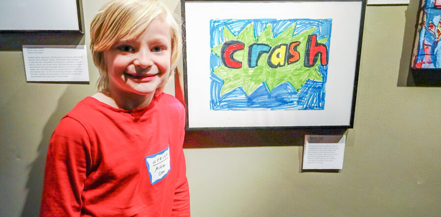
In “Crash,” artist Aiden Crow of grade 2 chose just the right style of typography and design, using bright colors, thick black outlines, and jagged edges in the background to convey the meaning of the word “Crash.”
In “The Underwater Room,” Serena Marciniszyn of grade 6 used colored pencils to draw a room and furniture that shows depth.
Claire Saulnier of grade 8 created a colorful and vibrant poster to reflect the feeling in lyrics by Taylor Swift. Claire used colored pencils and oil pastels, great composition, unique fonts, shapes, and symbols in her piece.


